What We Learned Building 3D Animations for Urban Armor Gear's CES 2026 Booth
Most brands bring their website to the trade show. They'll build a booth, load in the same product renders and hero images they use everywhere else, put them on screens, and wonder why nobody's stopping.
The problem usually isn't the visuals. It's that the visuals weren't built for the room.
Author
Mark Cernosia
Category
Process
READ TIME
5 min read
The Las Vegas Convention Center during CES week is 200,000 square feet of competing noise, competing screens, and competing fog machines. Attendees are on their feet, moving fast, looking at everything, registering almost nothing. You have maybe three seconds to create a moment of friction before someone moves on.
That's the real brief. Not make the product look good. Make it stop a person who is already overstimulated and running late to a meeting.
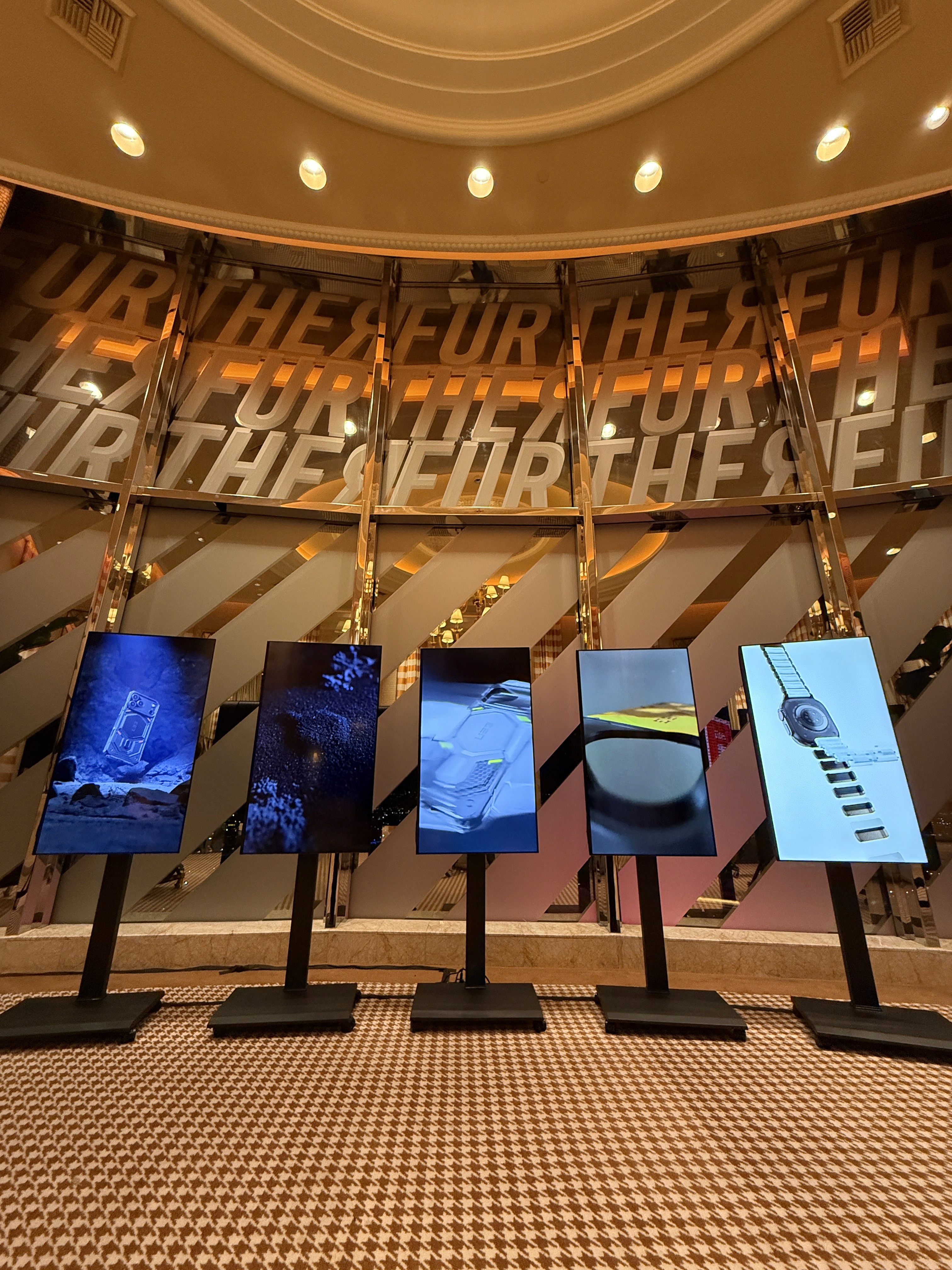
When Urban Armor Gear came to us for their CES 2026 booth, the ask was four separate 3D product animation films for their main display wall. Four products, four different stories, running on large-format 4K screens on a busy show floor. The minute we understood where this work was going to live, it changed how we built everything.
There's a version of this project where we make four really good-looking product films. Photorealistic, clean motion, polished transitions. They'd look great in a preview file. They'd sail through client review. And they'd completely disappear in that hall.
What makes 3D animation work for trade show displays is different from what makes it work on a website or a product page. On a show floor, you get the first three seconds of a loop. If nothing has happened by then, you've lost them.
The brief called for four films, and we treated each one as a distinct design problem.
Monarch is a multi-layer construction story. The product's value is in how it's built, so the film goes inside it, layer by layer.
Pathfinder was a design evolution piece. Where did this product come from and where is it going? That narrative arc plays well in a trade show environment because it gives a viewer who stops mid-loop something to track.
Color Story leaned into transparent materials and retro aesthetics. This was the most visual of the four, built around feel rather than function. On a 4K display with the right material work, that kind of film can stop people cold.
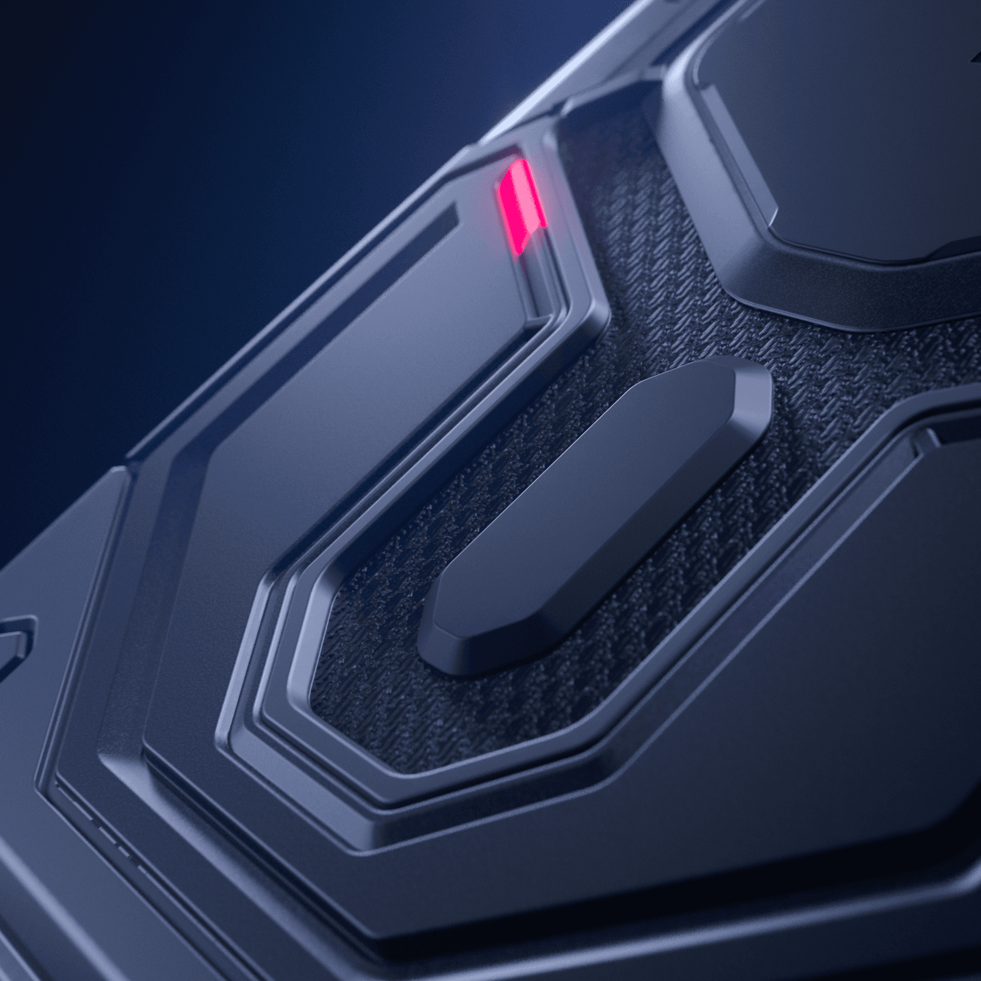
Craftsman was the deep material dive. Forged carbon. This one was built for the viewer who stops and leans in, which meant the texture work had to hold up under that level of scrutiny.
Four different tones, four different pacing structures, designed to work together on a wall but each able to stand alone.

The Craftsman film is where we spent more time than I'll comfortably admit on a single Kevlar texture.
Not because anyone asked us to. Not because it was going to dominate a key frame. But because material detail is cumulative. When everything is right, the viewer doesn't consciously register any single element. When something's slightly off, there's a vague sense that something feels wrong, even if they can't tell you what.
That gap between this looks right and I'm not sure about this is exactly where the work lives. Getting the invisible stuff right is most of what makes the visible stuff land.
After CES, UAG's Art Director sent us a note. The animations were the first thing people gravitated toward when they walked in and a hit and a huge success.
That doesn't happen because the animations looked good. It happens because they were built specifically for that environment, that viewing distance, that audience, and that amount of available time.
The room has requirements. Figure out what they are before you start.

